Polygraphy.info Media Group Rebranding
It’s a simple, yet effective brand system, that we’ve developed in 2009 for Polygraphy.info. It’s the biggest Bulgarian catalog of companies in the printing business, advertising agencies, graphic design studios and other related structures.
The task wasn’t easy – to rename and rebrand 3 connected websites, so that it’s clear that they are part of the same media group and meanwhile make the new graphic system open enough, so that new websites could be added lately.
To make the long story short – after series of graphic and naming proposals – the client picked the “label” shape and adopted the “.info” domain style for all its projects.

Here are the previous logos of Polygraphy.info and Prepressbg.com.
![]()
The first approach was to develop a logotype family using one font style (the classic Helvetica) and 1 color graphic elements, based on 1 shape – the circle. Logically – if there’s a 4-th project – it would be with the same logotype and another circle mark.
![]()
![]()
Then we’ve tried something different – to take 2 graphic shapes ( small circle + curve ) and create logos by combining them in different compositions.
The stylized icons are an attempt to represent the theme of the projects with minimum elements. The orange one is a “sheet of paper , between 3 print leases / print rolls. The green one is a reference to an element that’s pressing and testing 2 sheets. Blue is like and eye with 2 apples or like 2 people ( top view ) – reading each other as a paper.
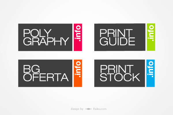
Of course – abstract logo shapes are a bit risky sometimes, so Polygraphy.info bet on our final proposal.
It answered their needs best – this design of this “web label logo” is easy to adapt with no additional cost for logo design. Actually the 4-th logo – “Print Stock” is done by the client. The rectangular shape fits in any kind of graphic environment – either web or print. It’s distinctive in small or large scale, very readable. Also in terms of graphic composition – it’s the most compact solution, because the logotype is locked into the mark itself.
We were also commissioned to make 3 web layouts for the 3 sites:


The designs are elegant and different, but share common principles. This gives them the desired distinctiveness.
It’s always nice to see few years later how the designs you’ve previously created are resisting the new trends and the new needs of the client!
Check for yourself at:
polygraphy.info
printguide.info
bgoferta.info
printstock.info
and the new brand member
printidea.info .