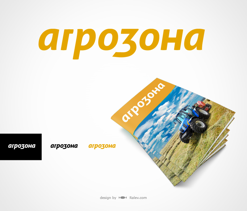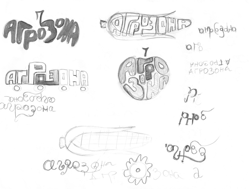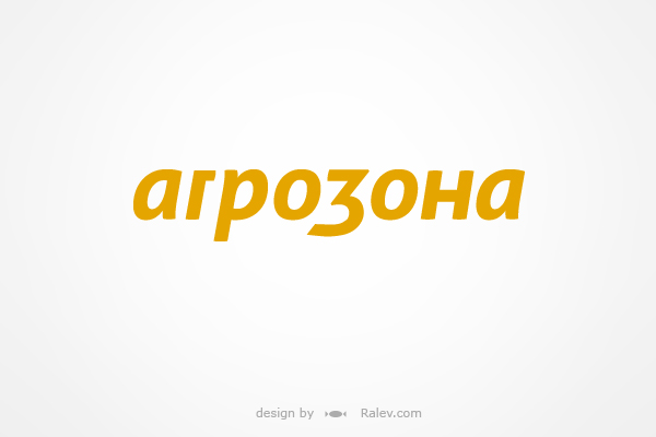
“Агрозона / AgroZone ” is a Bulgarian agronomy magazine. We developed several Cyrillic logotypes and this is the selected one. Simple, elegant and friendly – it is great for usage everywhere.
We always present logos in black & white since this is very important for their further use. It is crucial for a logo to be good-looking in 1 color / tone . A logo could be engraved, stencilled, etc. One never knows how much money a good logo could save.
Branding materials.
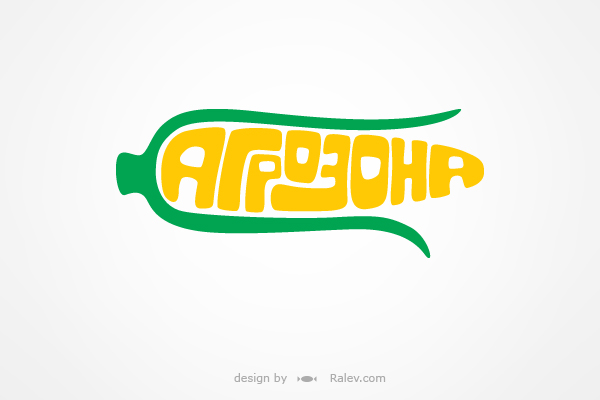
These are the other design-developments that we offered to the client:
Serious and elegant but not boring – curving lines and elegant serifs that make the logotype design vibrate. Classic green color combination.
This logotype is inspired by agro cultures – the “o” letters look like leaves as does the lower part of the letter “З”. All other letters are curved in the same manner.
You may notice that the last “A” is flipped, and also the “o” letters in the middle are mirrored. This is a graphic technique that makes the composition look tight and strong.
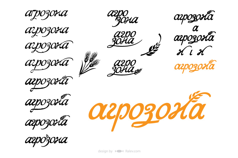
Classic interpretation that expresses elegant and friendly feeling.
The last one – funny and artistic. We love to experiment – especially when it comes to letters 🙂
You can find more information on Agrozona on their website, created by our team.
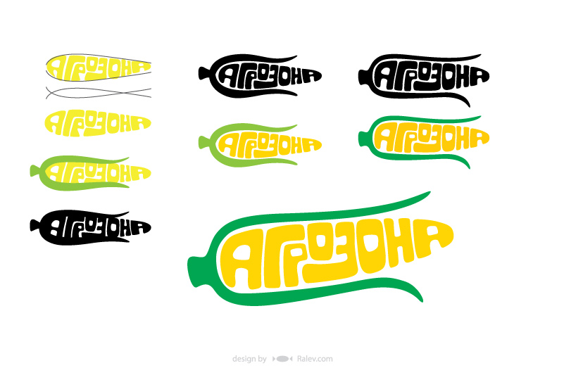
Materials from the logo design process.
