“ЗЕМЯ” translated from Bulgarian means Earth and “.bg” is the domain extension for Bulgaria. It is a logotype design for a local agronomy magazine. Its beauty is in the module play – all the letters are constructed оf one shape. The logotype is inspired by the nature where everything is connected, logical and balanced.
The logotype on magazine cover. Black & white and small size.
Some corporate brand materials – a badge and car branding.
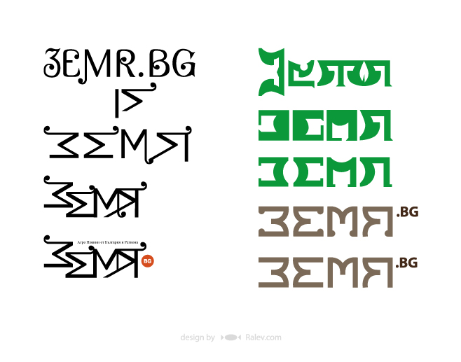
And here are some other design-developments that we offered the client:
We often say that the perfect design for a graphic task should be one but we just love to experiment with variety of styles. This is a more feminine approach – letters that swirl like a growing plant.
This work is close to the previous. In this case we tried to make the letters look like growing beans.
The module play in a different, more artistic and expressive manner.
The design of these letters reminds more of agronomic tools.
Here is another option with softer, more friendly look. The round shapes are very trendy these days, so we tried to do something in this fashion.
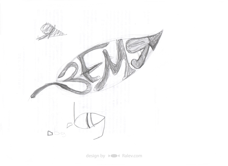
Our final proposal is an artistic logotype in the shape of a leaf as a common symbol of nature.
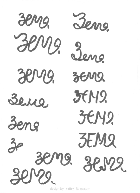
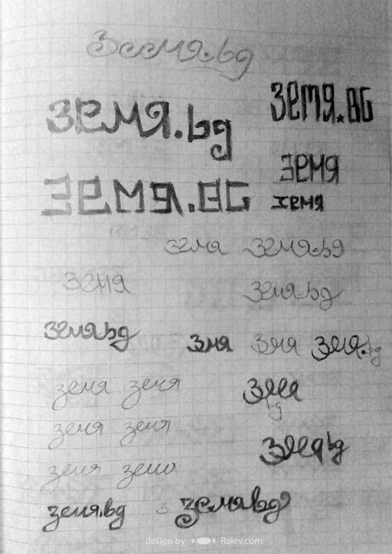
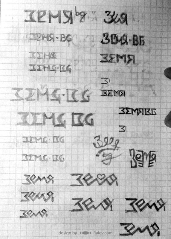
Materials from the logo design process.


