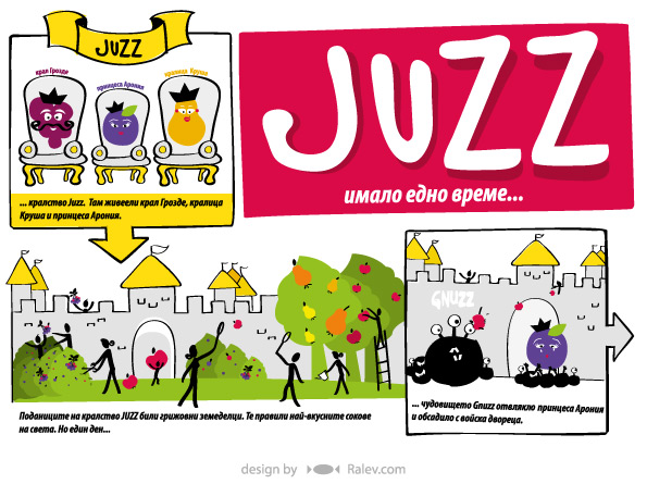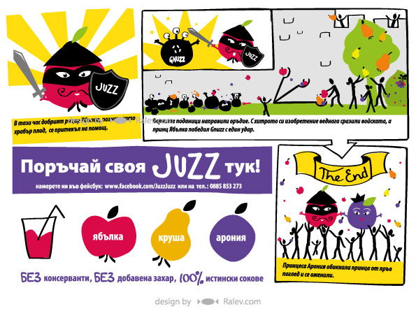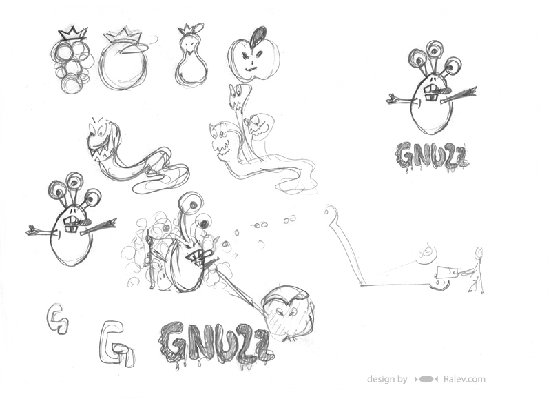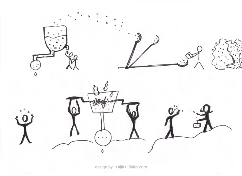

It’s a real new Bulgarian organic apple juice produced by Albena AD. We were approached in the early stage of the marketing, where there wasn’t any name and brand design. The blank sheet of paper and the total freedom gave us good inspiration boost. The result was the name “Juzz”. A jazzy juice that should bring happiness in our lives. Short name with great potential for development.

The core of the brand design – a simply shaped apple logo, as drawn from a child. The elements ( the apple mark and the Juzz logotype ) could be used separately. The red color represents the special botanic sort of the fruit from which the juice is made . The letters of the logotype are picked carefully to convey the idea of the organic origin of the product. Simple as that 🙂 And tasty as well!

The business card design is, of course, related to the general brand vision.
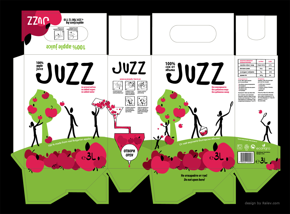
A design version of the packaging before the final revisions ( clickable )
the die cut ( clickable )

The packaging in action. As you can see – the brand design is noticeable and engaging in a real environment as well as on-screen.
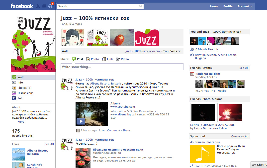
A good brand design is always easy integrated in the popular media and marketing channels. You can visit the JUZZ facebook group here.

“Organic” doesn’t mean fancy… in our heads this could be related to images that are funny and in a weird way. Their biggest advantage is that they are different from the mainstream images on the transitory packaging design of the non-organic products.

The “white-ish” proposals ( including the selected design ) were dictated by the idea that a bright, organic product needs bright packaging design with less inc. As you know – the less inc you are using, the more environmental friendly are your designs. Another curious fact about the juice you can notice is that in the picture above there’s a logo proposal where the J is designed as a straw. Later on we abandoned the straw idea as an unnecessary detail. The more “organic” logotype won.
You can contact the producers @ Juzz.bg
Unlock other brand materials

