“Friction Code is a clothing brand for young active people with a strong personality united by their love for music. The products have unique expression inspired by contrast between urban music cultures and street lifestyles of those people who accept the music as an institution. The design philosophy of Friction is focused on keeping longer sense of music and transformed music vibe into details of the clothes. All of our products are limited edition or handmade, because we respect human personality.”
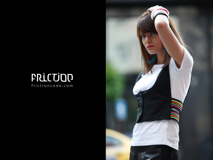
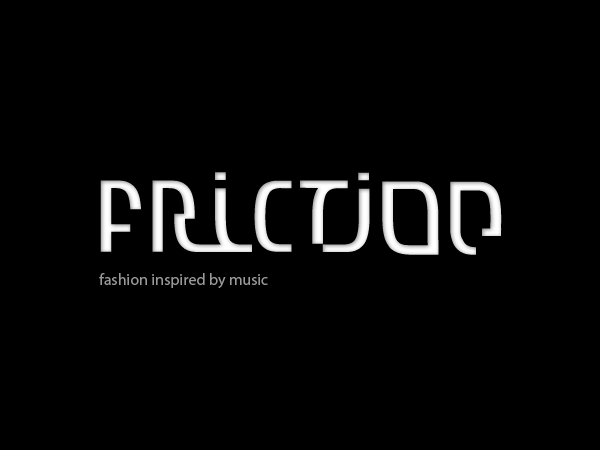
If you are the street type – you’ve basically seen everything. That’s why we tried to approach the logo design from an unusual perspective. One that even we haven’t seen.
Combining the 2 words “friction” and “code” in one custom logotype which could be read in one direction, without moving the logo. Yeah, it’s a bit tricky, but we’ve done it!
Some colored variations of the brand design, provoked by our focus group which found the logotype too “designish” and “advanced”. So, logically, the next goal was to give the users a hint about the second “code” word, that’s hidden in friction. For good or bad – at the end the client picked the “save” variation with the clean not-so-original logotype, which you can see bellow. Damn focus groups 8)
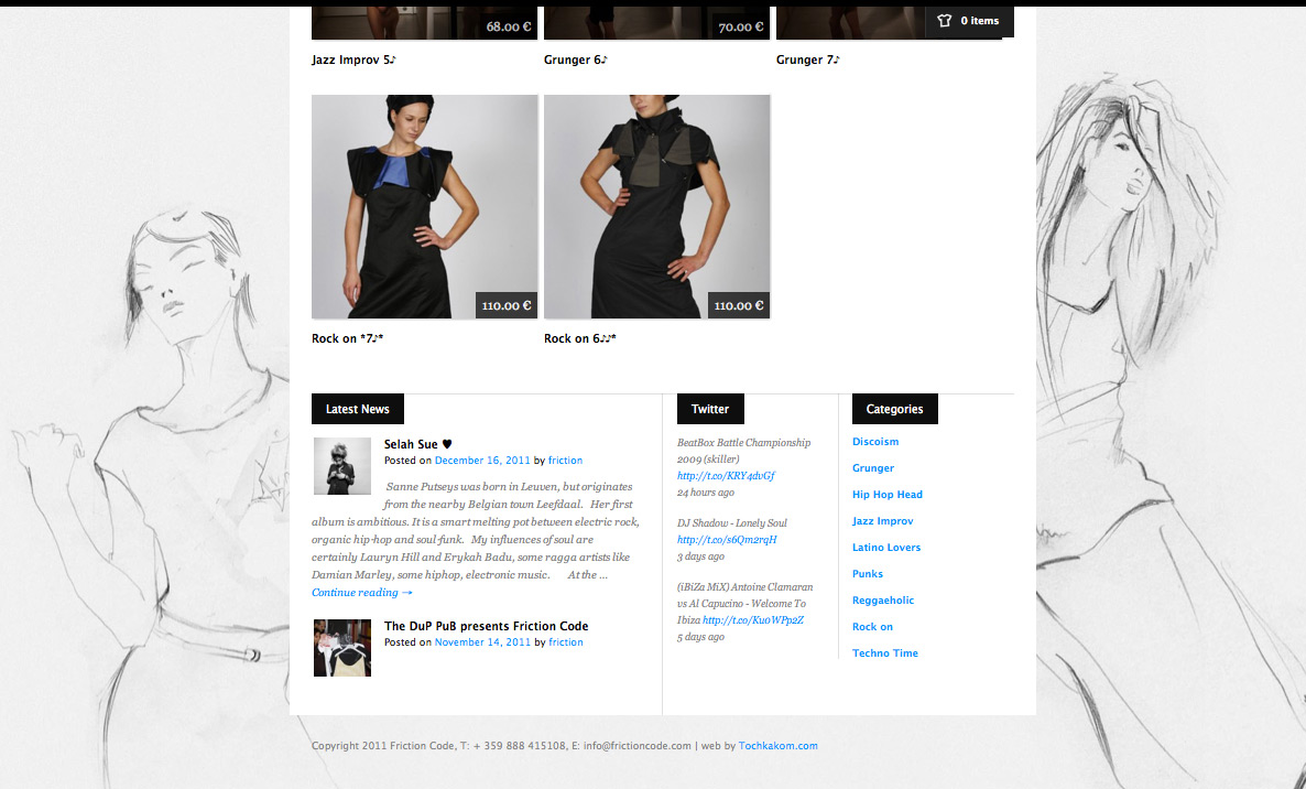
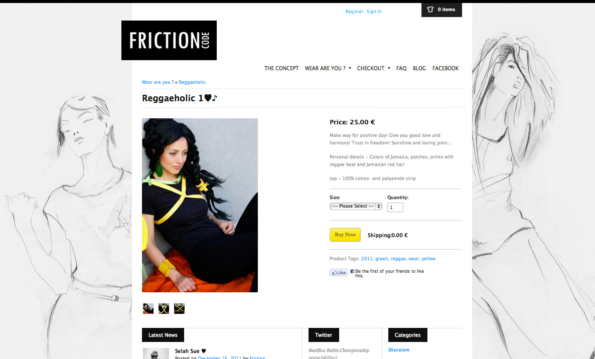
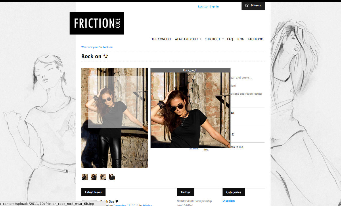
The screens are from the real website where you can shop in this very moment.
It’s also done by our studio.
The clean interface makes it possible to focus on the clothing.
The main goal of the site is to be easy for use.
You can check some videos from the making of the logo in our design blog.


